Monday, September 26, 2011
Yearbook Cover
This is the current yearbook from my old high school. My mom is the yearbook advisor there, so I found this laying around the house and thought it was a good example of graphic design. Every single book cover is an example of graphic design, and I figured yearbooks are no exception. Clearly its function is to show people all the events that happened during the school year, and the cover kind of gives an introduction to that. I like how it was designed this year, because "Post" has photos of students participating in different activities, like a bonfire, a football game, and the cheering section for the basketball teams. Plus the title stands out because the background is entirely black, which means all the words come to the foreground even more and generate interest in what other pictures are inside.
Sunday, September 18, 2011
Wine Label
This is a label from a wine bottle I found in a store the other day. I thought it looked really cool, so I took a picture of it. It's a "specialty" label for Halloween, so I think the font suits it well, especially since the wine is called "Twisted". Similarly, the tree beneath the name reflects the font, and I like how the colors are kept to a maximum of three so the image isn't cluttered. Overall, I think it's a really good design, especially for a wine bottle, since it's printed in a relatively small space--too much would make it appear way too chaotic to be an effective design.
Saturday, September 10, 2011
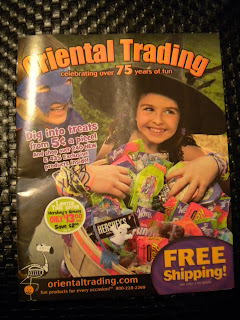
Magazine Cover
This is a cover for Oriental Trading magazine, which a magazine that sells toys, candy, and decorations for holidays. I got it in the mail the other day, and thought it would be good for the blogging assignment. I don't necessarily think it's the best design, although every cover for this magazine typically looks the same. For the most part, the type is two different colors and the fonts are within a close enough range of similarity that it's not really that distracting. But I do think the way they're laid over the photograph is a little distracting, maybe because the photo is so busy (the candy, the kids in costume, along with the type,the offers for free shipping, etc). Overall, it gets its message across, but I think the design isn't executed as well as it could be.
Sunday, September 4, 2011
Business Card
This a business card I picked up from my piercer/tattoo-er, a guy in Champaign. I think it's a really good design for a business card, because the front of it is relatively simple, while the back of it contains all the information necessary. There is nothing "extra" to it, but it gets the point across very well. I really like the design on the front because of its simplicity, and the color scheme (a shade of maroon with gold lettering) is attention-getting. I really like the piece because of its style, and nothing seems like its out of place. Only one font is used on the front, and two on the back, so there isn't really any kind of distraction that I can see that might hamper the effectiveness of the piece.
Subscribe to:
Comments (Atom)


