Saturday, September 10, 2011
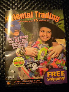
Magazine Cover
This is a cover for Oriental Trading magazine, which a magazine that sells toys, candy, and decorations for holidays. I got it in the mail the other day, and thought it would be good for the blogging assignment. I don't necessarily think it's the best design, although every cover for this magazine typically looks the same. For the most part, the type is two different colors and the fonts are within a close enough range of similarity that it's not really that distracting. But I do think the way they're laid over the photograph is a little distracting, maybe because the photo is so busy (the candy, the kids in costume, along with the type,the offers for free shipping, etc). Overall, it gets its message across, but I think the design isn't executed as well as it could be.
Subscribe to:
Post Comments (Atom)

No comments:
Post a Comment